This article explores the visual languages defining a new era of Indian skincare.
A brand does not live in a logo, a colour palette, or a carefully curated set of design assets. It lives in the feelings, memories, and assumptions people form when they encounter it. While reading The Brand Gap on an ordinary Monday night, one idea particularly stayed with me: alignment, not consistency, is the foundation of a living brand.
Most brands mistake visual identity for a collection of assets. The best brands use it as a way of expressing what they believe. It forms the foundation of a brand’s visual communication, influencing how consumers perceive, experience, and connect with it. Every typeface, colour, image, and design choice becomes a signal of its values, personality, and worldview.
A strong visual identity therefore goes beyond creating recognition; it creates meaning. It builds a visual world that consumers can enter, understand, and emotionally connect with. This is particularly evident among a new generation of Indian skincare brands that have moved beyond conventional beauty codes to craft identities that feel culturally aware, strategically distinct, and deeply aligned with their philosophies.
The following five homegrown skincare brands demonstrate that great design is not about following trends or achieving perfect consistency. It is about creating a cohesive expression of a brand’s deeper purpose.
1. Aminu:
Founded by husband-and-wife duo Prachi Bhandari and Aman Mohunta, Aminu was created from a deeply personal understanding of skin health and a desire to bridge science, art, and holistic care.
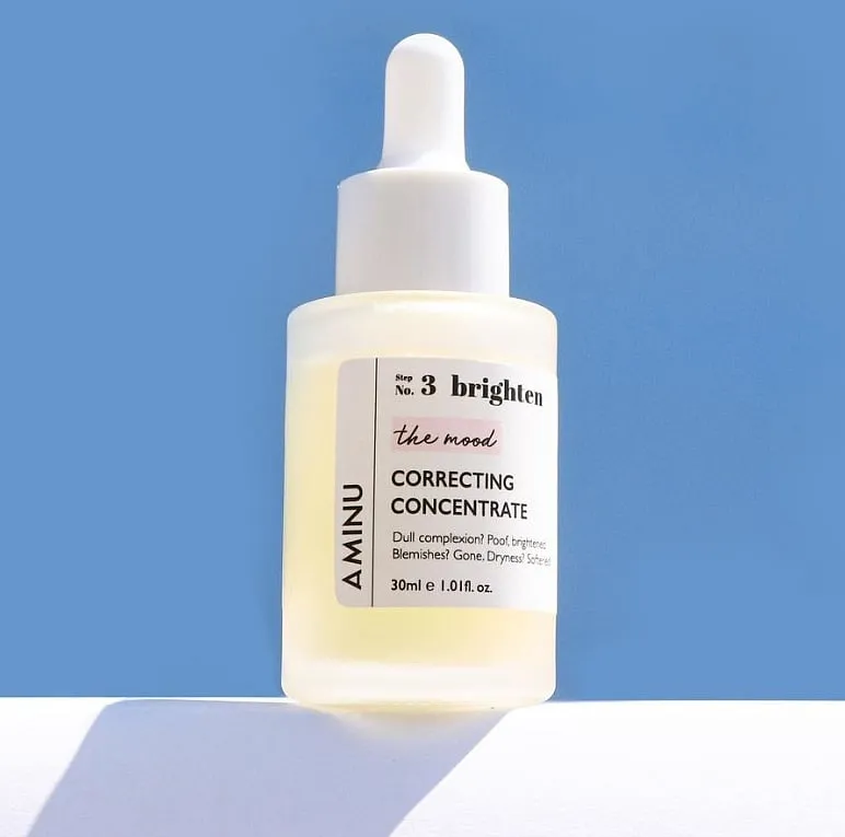
In a wellness market where many brands compete through loud colours, exaggerated claims, and trend-driven aesthetics, Aminu adopts the opposite strategy. Its visual identity proves that restraint can be a powerful form of differentiation.
Through a muted colour palette, understated typography, tactile photography, and spacious compositions, Aminu creates a sense of stillness that mirrors its philosophy of mindful self-care. The brand positions itself closer to contemporary lifestyle and design brands than traditional beauty companies, allowing it to communicate aspiration through atmosphere rather than excess.
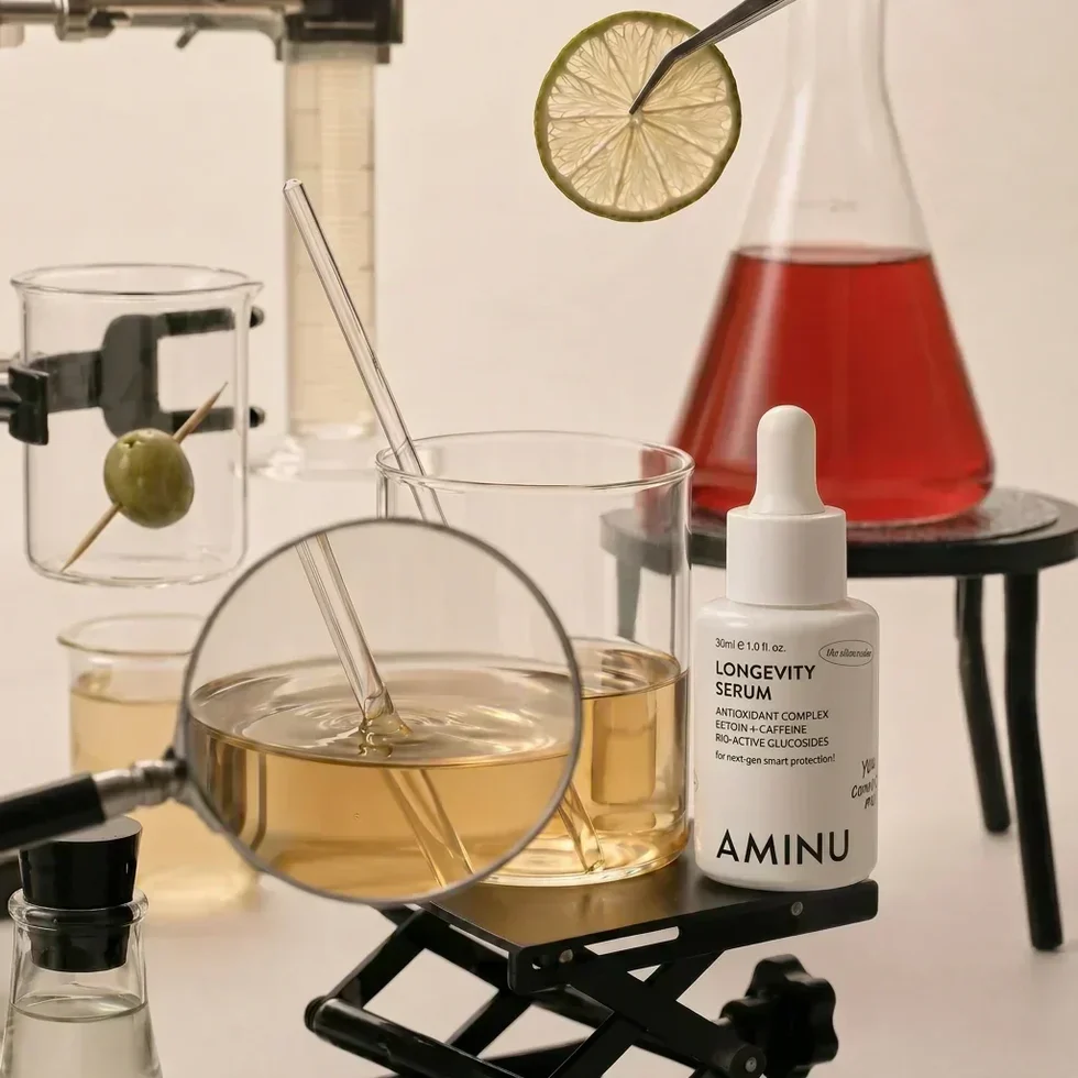
This approach is particularly evident in the Longevity Serum. The product translates complex ideas around cellular health and scientific innovation into a visual language that feels elegant rather than clinical. Its sleek packaging, minimal typography, and futuristic design cues communicate precision and credibility, while editorial imagery and soft visual textures maintain emotional warmth.
Aminu demonstrates that luxury does not need to be loud. By using subtle design choices to communicate sophistication and trust, the brand creates a sensory world where calm itself becomes a distinctive visual signature.
2. Dearist:
Founded by Meher Jadhwani, Dearist is built on the idea of redefining wellness through transparency, simplicity, and conscious care. This philosophy is translated into a visual identity that embraces soft minimalism, botanical purity, and a thoughtful approach to contemporary self-care.
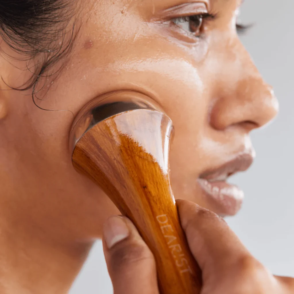
The brand’s visual language is rooted in restraint. Through its muted colour palette, refined typography, clean layouts, and natural imagery, Dearist creates a visual identity that feels calm, intentional, and uncomplicated. Rather than relying on overt representations of nature or traditional wellness symbolism, the brand uses subtle botanical cues and a quiet design language to communicate its philosophy of conscious consumption and holistic well-being.
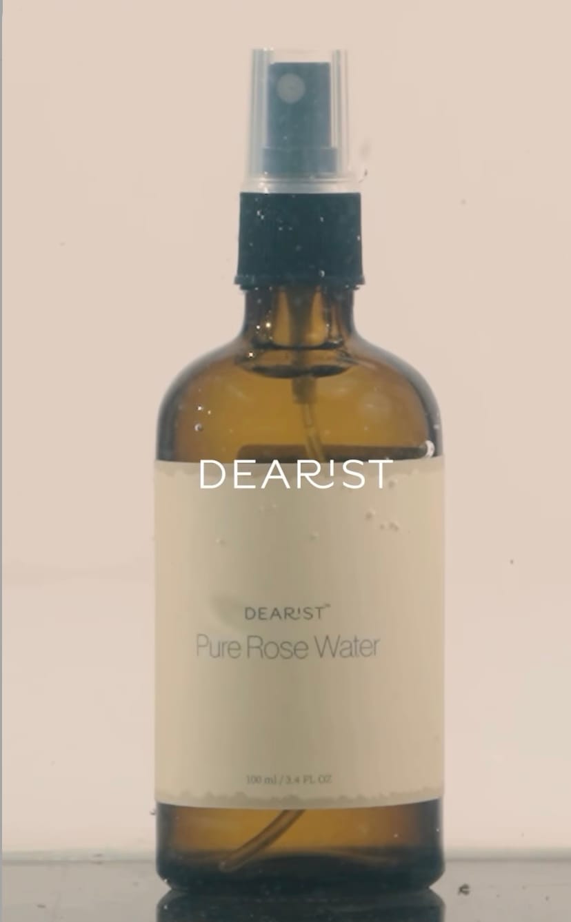
The Edible Pure Rose Water encapsulates this philosophy. The amber glass bottle, minimal labelling, and functional spray format transform a simple ingredient into a considered ritual. The transparent vessel and absence of visual excess reinforce ideas of purity, craftsmanship, and ingredient integrity.

A significant aspect of Dearist’s identity is the balance it strikes between contemporary clean beauty and traditional botanical wellness. Unlike many Ayurvedic-inspired brands that rely heavily on ornate patterns, rich colours, and heritage-focused visuals, Dearist adopts a modern apothecary aesthetic. At the same time, it avoids the sterility often associated with clinical beauty brands by introducing warm neutral tones, organic materials, and soft photography that
evoke comfort and intimacy.
From its typography and earthy, muted palette to its packaging and educational content, the brand consistently communicates the idea of “less, but better.” Every visual touchpoint feels intentional, creating an experience that is premium yet approachable, modern yet rooted in nature.
Dearist demonstrates that a successful visual identity makes its values visible. Through its quiet design language, the brand translates simplicity, care, and thoughtful expertise into an
experience that consumers can recognise, connect with, and trust.
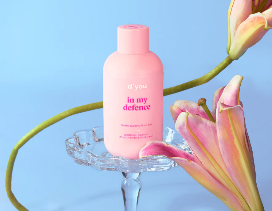
3. D’You:
The popular Indian skincare brand, was founded by Shamika Haldipurkar. She launched the brand with the goal of creating high-performance, multitasking skincare products designed to simplify complex multi-step routines.
D’You built a visual identity that feels bold, contemporary, and unapologetically opinionated. Every aspect communicates the same message: this is a brand for consumers who like to think for themselves.
D’You’s Hustle is the strongest embodiment of the brand’s visual philosophy—where science, personality, and culture converge into a skincare experience that feels intelligent yet approachable. Created as an all-in-one serum designed to simplify overwhelming skincare routines, Hustle itself reflects D’You’s broader belief that efficacy should eliminate complexity rather than add to it. The product was formulated with 11 active ingredients to replace the need for multiple single-purpose products, positioning it as a solution to the overconsumption often encouraged by modern skincare trends.
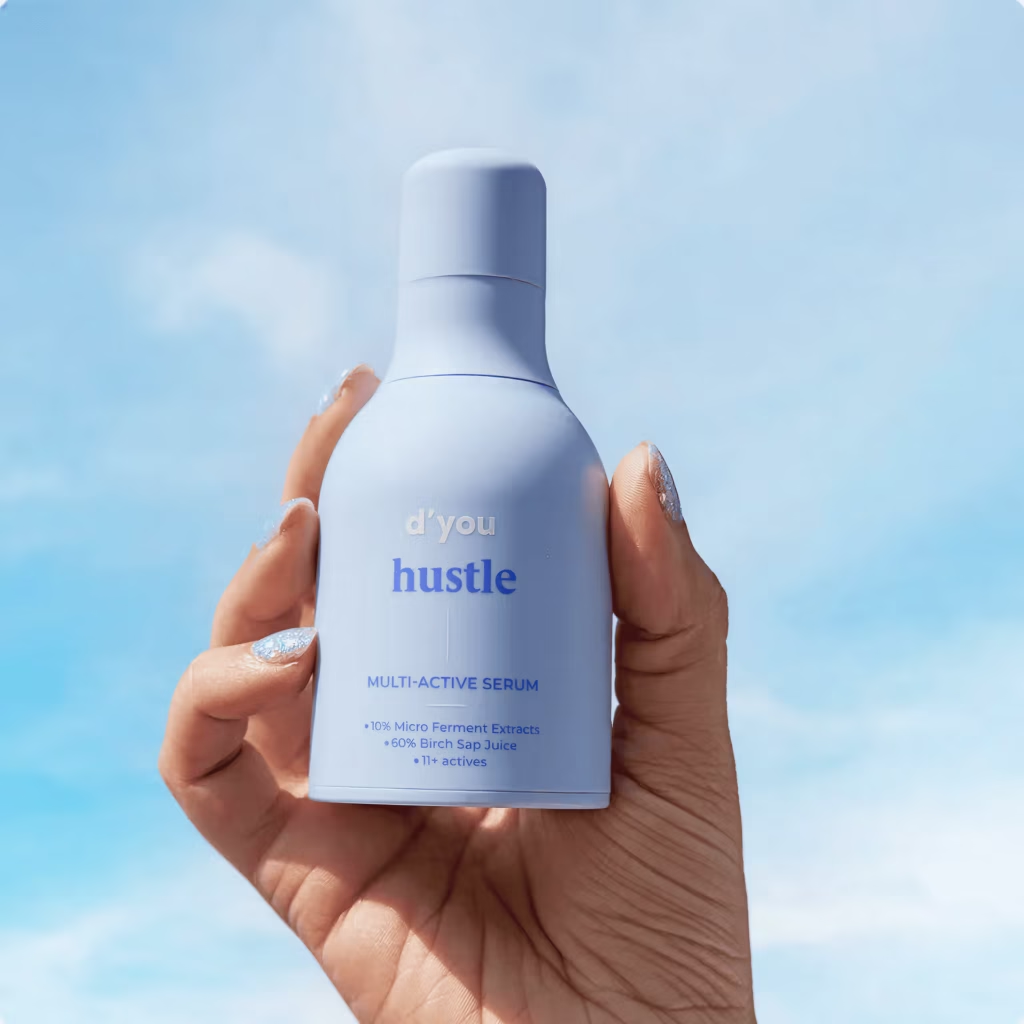
The name Hustle itself plays a significant role within this identity. Rather than describing a skincare concern or hero ingredient, it communicates a mindset. It speaks to the ambitious, modern consumer who is constantly balancing productivity, self-care, and everyday demands. This conversational approach to naming is a defining characteristic of D’You’s verbal identity, turning products into personalities rather than formulations.
The visual language surrounding Hustle extends beyond its packaging into campaigns,
photography, and digital communication. Dreamlike cloud imagery, expressive colour, and youthful art direction soften the seriousness often associated with science-led skincare, making education feel engaging rather than intimidating. This balance between scientific credibility and emotional warmth is what differentiates D’You from conventional clinical beauty brands.
D’You treats visual branding as an ecosystem rather than a packaging exercise. Its visual
identity, tone of voice, product philosophy, and educational approach all point towards the same belief: skincare should be rooted in science, not fear. It has built something far more valuable, a visual identity that feels instantly recognisable and culturally ownable.
4. Indē Wild:
Founded by Diipa Khosla, an Indian-born fashion influencer, digital content creator and entrepreneur. She is the founder of the beauty brand indē wild.
The brand has created a visual language that feels globally relevant while remaining
unmistakably rooted in Indian culture. Its success lies not in simply incorporating cultural references, but in reimagining them for a new generation.
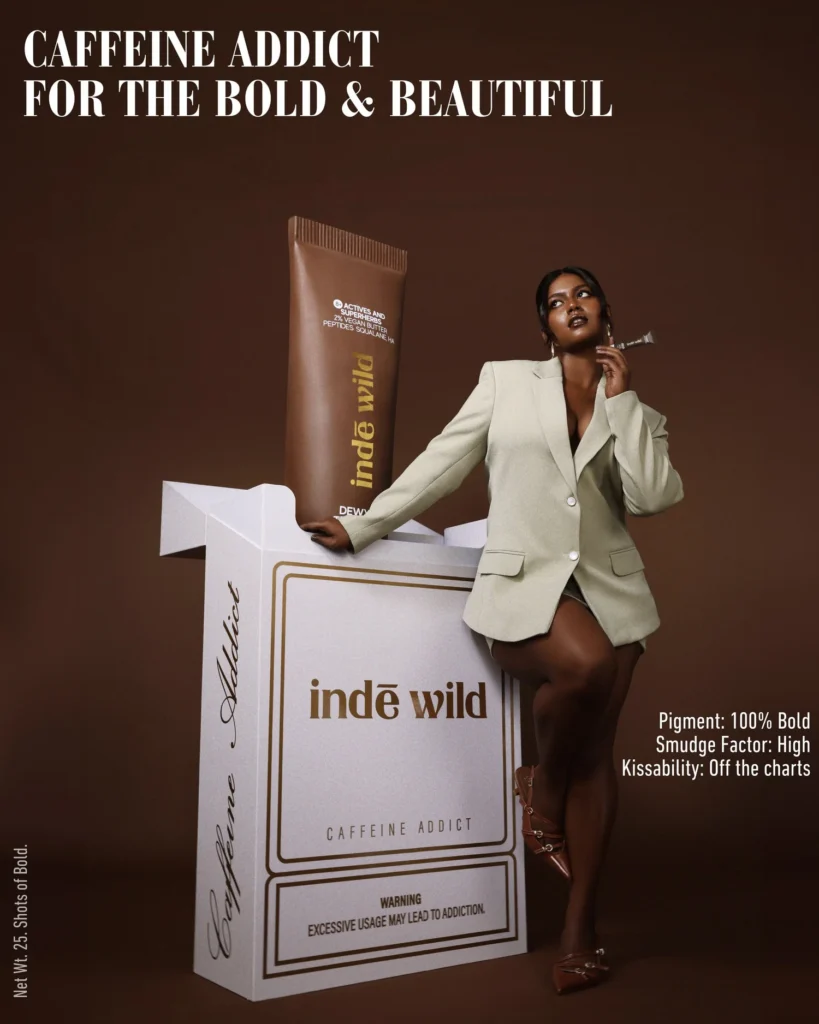
At the heart of the brand’s identity is the interplay between nostalgia and modernity. Through its concept of “Ayurvedistry™”—the intersection of Ayurveda and modern science—Indē Wild translates age-old rituals into a modern visual experience. Soft, sunlit imagery, vibrant colour palettes, editorial-led visuals, coexist with familiar cultural cues, creating a brand world that feels both aspirational and deeply personal.
The launches of Chai DLT and Coffee DLT are particularly strong examples of the brand’s visual language. Both campaigns drew from practices deeply embedded in everyday Indian life, using nostalgia as a powerful bridge between heritage and modern self-care.
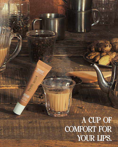
Through visual cues associated with traditional chai and coffee culture such as familiar colours, textures, vessels, and moments of daily pause. Rather than simply referencing Indian heritage as an aesthetic motif, Indē Wild reinterpreted these cultural memories through a modern lens, combining playful storytelling, bold colour palettes, and polished beauty imagery.

The campaigns also demonstrate the brand’s broader visual strategy: balancing the warmth and familiarity of Indian traditions with the aspirational qualities of a global brand. Rich tones, sensory-driven imagery, and expressive art direction evoke feelings of comfort, indulgence, and personal ritual, while contemporary typography, sleek product styling, and clean compositions ensure the brand remains fresh and relevant to a younger audience.
By turning universally recognised experiences like drinking chai or coffee into a language of skincare and self-care, Indē Wild creates an emotional connection that extends beyond the product itself. The launches showcase how visual identity can be used not only to communicate what a product does, but also to tell a story of culture, memory, and belonging.
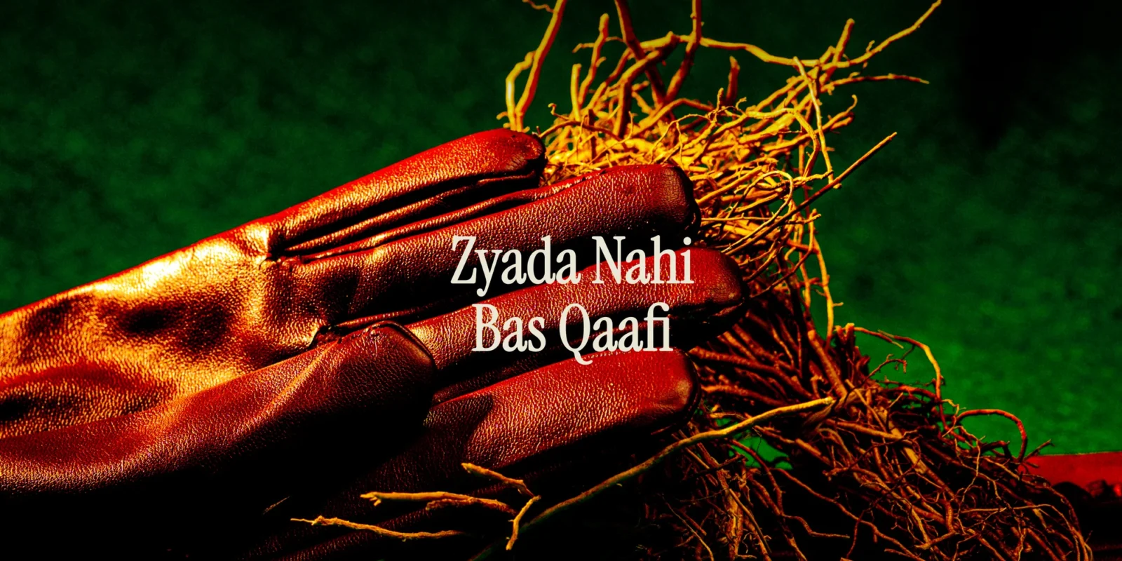
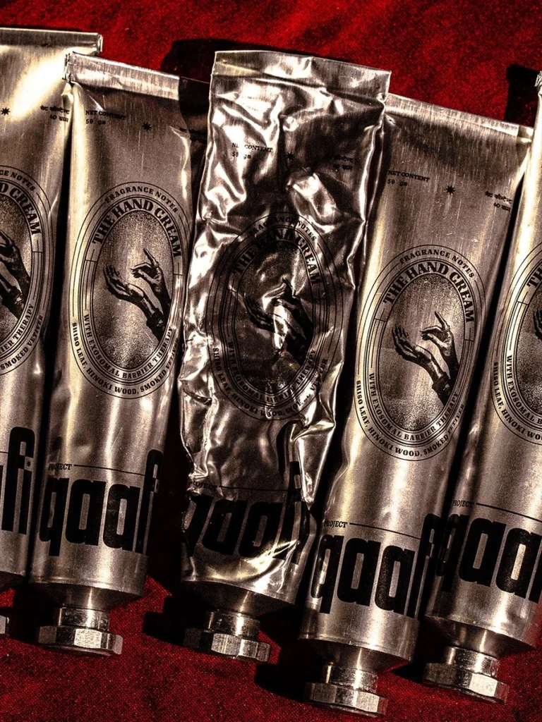
5. Project Qaafi:
Founded by Aahan Chatterjee, Project Qaafi is a Mumbai-based, design-led skincare brand with the vision of redefining Indian beauty by combining traditional botanical knowledge with science-backed actives. Guided by its philosophy, “Zyada nahi, bas Qaafi” — the idea that effective skincare lies in simplicity and using just enough — the brand extends this principle beyond formulation into its entire visual identity.
Project Qaafi embraces a bold and unconventional visual language. Through strong typography, industrial material choices, and graphic compositions reminiscent of contemporary design publications, the brand establishes a distinctive presence that feels both modern and deeply rooted in Indian culture.
The Hand Cream serves as the strongest expression of this design philosophy. The aluminium tube immediately challenges conventional beauty packaging, replacing delicate luxury cues with a sense of utility, durability, and honesty. Its raw, tactile finish and infinitely recyclable material align with the brand’s values of conscious consumption and purposeful design, demonstrating how sustainability and aesthetics can coexist.

A defining strength of Qaafi’s identity is its nuanced use of Indian visual culture. Instead of relying on predictable Ayurvedic symbolism, the brand draws from everyday forms of visual nostalgia — regional calendar typography, matchbox graphics, firecracker imagery, and vintage print aesthetics. These references are reinterpreted through a contemporary lens, creating a visual language that feels culturally authentic without becoming nostalgic or decorative.
Typography further anchors this identity. The bold wordmark and custom letterforms influenced by Indian scripts establish a bridge between local heritage and modern design sensibilities. Here, culture is not treated as an embellishment but is embedded into the very structure of the brand.
At the heart of Project Qaafi’s visual identity lies a compelling consistency between its
philosophy and its execution. The brand’s commitment to mindful consumption, intentional product launches, and efficacy over excess is reflected across its packaging, design choices, and communication. Every touchpoint reinforces its core philosophy of clarity, restraint, and “just enough.
Project Qaafi proves that effective branding is not about adding more, but about saying more with less. Through a visual identity that is bold, intentional, and rooted in cultural memory, the brand transforms its philosophy of “Zyada nahi, bas Qaafi” into an experience that is instantly recognisable and impossible to overlook.
Together, these brands represent a larger transformation within Indian beauty. Rather than borrowing established visual languages from global competitors, they are creating identities shaped by local culture, contemporary values, and distinct worldviews.
Their success reveals that memorable branding is not about being louder, more decorative, or more visually complex. It is about building a visual system where every colour, typeface, image, material, and interaction reinforces a deeper belief.
Whether through Aminu’s quiet luxury, Dearist’s mindful simplicity, D’You’s optimistic science, Indē Wild’s cultural nostalgia, or Project Qaafi’s graphic reinterpretation of Indian identity, these brands prove that visual identity is not decoration—it is the process of transforming belief into something people can see, feel, and remember.
Read More by Vanshika Rawtani: